A STONE DISPLAY SOLUTION EXPERT !



Tile Showroom Design: How to Build a Showroom That Turns Visitors Into Buyers
Table of Contents
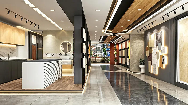
Two showrooms can stock the same tiles from the same factories and still perform nothing alike. The difference is rarely inventory — it is tile showroom design: the deliberate plan behind what visitors see first, what they touch, and what they remember when they leave. Design writer Ethan Anderson puts it plainly in a recent high-end showroom strategy guide: the showroom has become an experiential marketing tool, not a storage room with price tags. This guide breaks the discipline into 9 practical elements you can apply without rebuilding the building.
| Design Element | What Good Looks Like | Why It Sells |
|---|---|---|
| Concept | One clear story across the whole floor | Visitors remember a story, not 300 loose samples |
| Hero walls | Bestsellers at eye level, lit and untouched | Pulls the eye and anchors the price story |
| Backdrops | Neutral walls, one controlled feature color | Tile colors read true against the backdrop |
| Fixtures | Racks that match the design language | Premium fixtures raise perceived tile value |
| Lighting | Layered, high-CRI, built into the racks | Color accuracy is what actually closes tile sales |
| Vignettes | Small real-life room scenes | Buyers see the tile installed, not stored |
| Signage | Names, sizes and finishes labeled at the rack | Fewer repeated questions, faster decisions |
| Flexibility | Modular systems, movable towers | Seasonal refresh without renovation |
Tile showroom design: Why It Decides Whether Visitors Buy
Retail guidance for the ceramics trade is blunt about the stakes: presentation directly shapes purchasing decisions, because tile is chosen with the eyes and confirmed with the hands. A visitor who feels nothing in the first ten meters rarely reaches the consultation desk. Good tile showroom design does three jobs at once — it makes your best collections impossible to miss, it makes comparison easy, and it makes your floor worth a second visit. Retail buying guides such as this ceramic tile display primer summarize the mechanism: color, texture and finish must be visible and comparable before a customer commits.
Element 1 — Commit to One Concept for the Whole Floor
Every strong tile showroom design starts with a decision: what is this floor about? A minimal architectural story, a warm residential story, or a luxury stone story all work — mixing all three does not. Pick the concept that matches your main buyer, then hold every element below against it. A simple test: stand at the entrance for ten seconds. If you cannot name the story, neither can your customer.
Write the concept down as three rules
Turn the concept into three short rules — for example, “light wood and white steel, matte finishes, no clutter” — and tape them to the office wall. Every fixture order, paint choice and vignette prop either follows the rules or does not come in. This is how distributors keep a consistent floor when three people share the buying decisions.
Element 2 — Build Hero Walls Around Bestsellers
Every floor needs one wall that does the heavy lifting. Choose your 10-15 highest-margin or best-moving collections and give them the best sightline from the entrance, mounted full-face on a modular wall tile display so veining and texture read at human height. A hero wall is not the place for variety — it is the place for conviction. Deep ranges belong in the browsing racks behind it; the hero wall answers the question “what should I look at first?”
Element 3 — Design Backdrops That Keep Tile the Hero
Backdrop color is the cheapest design decision with the biggest visual cost when wrong. Dark or strongly colored walls distort how tile colors read and make the floor feel smaller; neutral light tones keep every collection honest. Two rules cover most floors:
- Stay neutral by default. White, light gray and warm beige backdrops let wood-look, stone-look and color ranges all read true as you rotate collections.
- Spend strong color in one place. A single deep-green or terracotta feature wall behind a hero range adds drama without lying about the products on it.
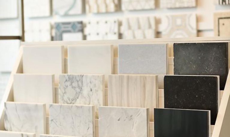
Grouping matters as much as paint. Guides on how to display ceramic tiles recommend organizing samples by color family and finish — glossy against matte, textured against smooth — so side-by-side comparison happens naturally at the rack instead of in the customer’s memory.
Element 4 — Choose Fixtures That Match the Design Language
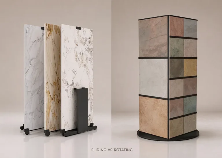
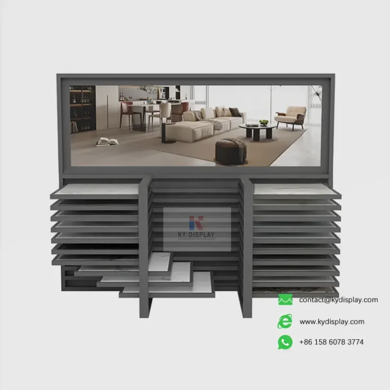
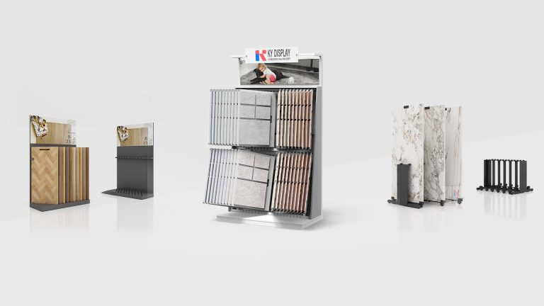
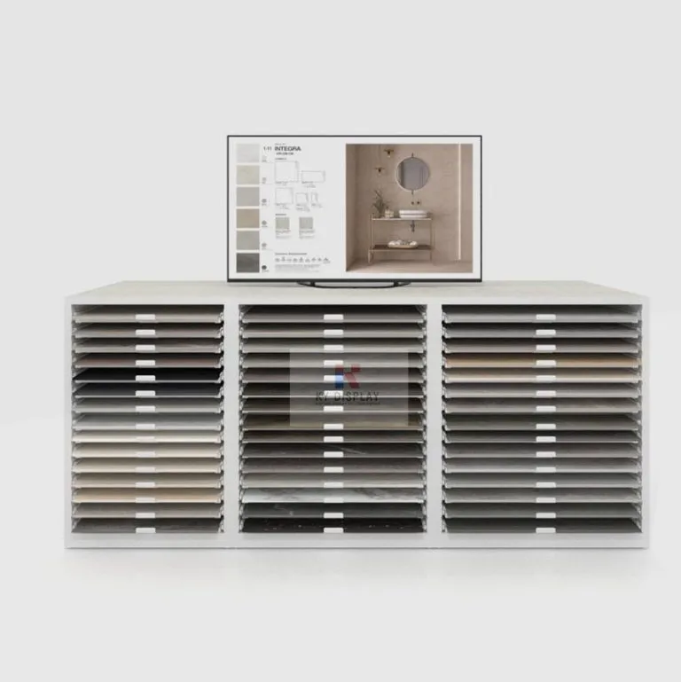
Fixtures are the furniture of a tile showroom design, and visitors read quality through them. A scratched, mismatched rack understates even premium porcelain; a clean powder-coated system with consistent sightlines raises it. Match the fixture style to the concept, and match the mechanism to the sample: pull-out and sliding systems such as the push-pull tile display stand suit dense ranges, freestanding towers suit islands and aisles — we compare the two approaches in freestanding towers vs tile display walls. For spec-by-spec buying criteria, see our guide to choosing the right commercial tile display rack.
Order fixtures with the design, not after it
The most expensive mistake is buying racks last. Fixtures decide panel size, sightlines, aisle width and lighting positions — every other element downstream. Involve the display supplier while the floor plan is still being drawn, and most can supply 3D renderings fitted to your dimensions before you commit.
Element 5 — Design Light Into the Space, Not Onto It
Lighting is the one design layer that changes how every tile reads, which is why it belongs in the design conversation from day one rather than as a ceiling grid afterthought. The full spec — CRI 90+, 3000K-4000K, 36 degree beam angles — is covered in our tile showroom lighting guide. At the design level, three moves matter most: layer ambient and accent light so hero walls hold contrast, integrate LED strips and LED backlighting into the racks themselves so pull-out panels stay lit, and keep color temperature consistent across the floor so the whole range reads as one collection.
Element 6 — Stage Lifestyle Vignettes Buyers Can Step Into
A vignette is a small, built scene: a tiled bathroom corner, a kitchen splashback, a hallway floor that continues past a doorway. Vignettes answer the question flat racks cannot — “what does this look like in a real room?” One or two well-built scenes beat a floor of scattered props, and the tile in each scene should be purchasable from the rack three steps away. Rotate the collection in the vignette each season so regular visitors always see something new — the tactics in our 10 proven tile showroom display ideas slot straight into this element.
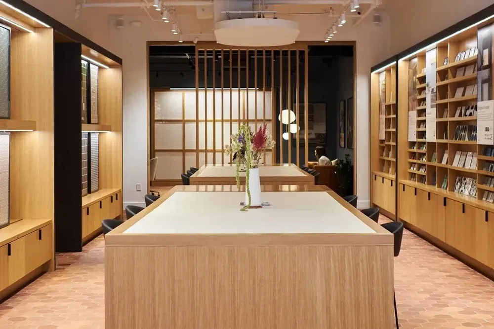
Element 7 — Make Signage and Branding Part of the Architecture
Signage is design, not paperwork. Every rack needs the collection name, size, thickness and finish labeled at the sample, so customers compare without a staff member and staff answer fewer repeated questions. Branding should be built into the fixtures themselves — laser-engraved logos on header boards and shelf trims read as part of the floor, not stickers fighting it. Retailers who invest in this layer consistently report shorter decision times, which is the quiet mechanism behind our guide to tile display racks for retailers.
Element 8 — Design In Flexibility for Seasonal Refresh
Tile fashion moves faster than fit-outs, so a rigid floor ages quickly. Design flexibility in from the start: modular racks that extend as ranges grow, castor-mounted sample towers that reconfigure between seasons, and header boards that re-skin without tools. Showrooms built this way refresh over a weekend; showrooms built with fixed carpentry wait years. Flexibility is also the honest answer to tile showroom design trends — they shift, and the floor has to shift with them without a renovation every time.
Element 9 — Close With a Consultation Zone Worth Sitting In
The last meters of the journey are where decisions happen, yet consultation corners are usually the worst-lit, most cluttered part of a floor. Design them properly: a work table big enough to spread six samples side by side, task lighting for true color comparison, sample storage within arm’s reach, and seating that lets a couple discuss a renovation instead of hovering. Trade guidance for premium showrooms is explicit on this point — dedicated design and co-creation hubs turn a supplier into a project partner, and project partners close larger orders.
Tile Showroom Design Mistakes That Cost Sales
- Three concepts on one floor. Minimalist lighting, rustic props and luxury stone vignettes in the same room cancel each other out — pick one story.
- Sample overload. Filling every wall with the full catalog lowers identification of the ranges you actually need to move; curate the floor, keep the catalog at the desk.
- Fixtures bought last. Racks chosen after the fit-out always fight the design — order them with the floor plan.
- One flat light layer. A single ceiling grid flattens texture and kills the hero walls; layer the light.
- Set-and-forget. A showroom untouched for three seasons reads as a showroom that is going out of business.
Get a Free Quote
Putting these 9 elements into a floor that already trades takes sequencing, not luck. KY Display has spent 16 years building custom tile, stone and flooring display systems for distributors worldwide — modular wall systems, push-pull racks, and fixtures with integrated LED backlighting — and supports them with a free 3D showroom plan built to your floor dimensions and brand style. Send us your showroom size and we will reply within 24 hours.
Frequently Asked Questions
1. What is tile showroom design?
Tile showroom design is the visual and spatial plan of the sales floor: the concept, hero walls, backdrops, fixtures, lighting, vignettes and signage that work together to present tile collections. The floor plan decides where zones sit; the design decides what each zone looks like and how it sells.
2. How is showroom design different from showroom layout?
Layout is the floor plan: aisles, zones, traffic flow and sightlines. Design is everything the visitor sees and feels inside that plan: colors, fixture styles, lighting, displays and branding. You need both — a great layout with flat design still reads as a warehouse.
3. What color should showroom walls and backdrops be?
Neutral light tones — white, light gray, warm beige — are the safest backdrop because they let tile colors read true and match any collection you rotate in. Reserve strong colors for one feature wall, never the whole floor.
4. How often should a tile showroom be redesigned?
A full redesign every 5-8 years is typical, but refresh continuously in small moves: re-aim lights, swap hero walls each season, rotate vignette props, and re-skin header boards. Modular display systems make these refreshes a weekend job instead of a renovation.
5. Can display racks be customized to match a showroom design?
Yes. Manufacturers like KY Display build racks to order: dimensions, colors, materials, laser-engraved logos and options such as integrated LED backlighting, so the fixtures follow the design language instead of fighting it. Ask for 3D renderings before production.
More Tile Showroom Guides
This guide is the design layer of the series. Start with our tile showroom layout guide for the floor plan, then apply the specs in the tile showroom lighting guide, and pull tactics from 10 proven tile showroom display ideas. For fixture selection, see our guide to choosing the right commercial tile display rack.