A STONE DISPLAY SOLUTION EXPERT !



Tile Showroom Layout: How to Plan 8 Zones That Turn Displays Into Sales
Table of Contents
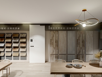
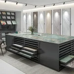
A tile showroom lives or dies by its floor plan. Buyers rarely announce what they want; they walk, glance, touch, and decide. A well-planned tile showroom layout quietly scripts that journey — pulling visitors past your best-margin lines, giving every category a clear home, and ending at a consultation desk instead of an exit. This guide breaks the plan into 8 practical zones, gives you real dimensions for aisles and display heights, and maps each zone to the right display fixture.
Tile Showroom Layout: Why It Decides Whether Samples Sell
Tile is a touch-and-compare purchase. Industry research keeps confirming that customers who physically handle samples convert at far higher rates than those who only look — which means your layout’s first job is to move people from “browsing from the doorway” to “hands on the product” in as few steps as possible.
Three layout principles do most of the work:
- Zoning beats clutter. Grouping by material — ceramic, porcelain, natural stone — removes comparison paralysis and lets buyers self-navigate without flagging staff.
- Aisle flow beats density. Racks crammed wall-to-wall feel like a warehouse. Clear sightlines down a central spine make a mid-size showroom feel like a gallery.
- Refresh cadence beats perfection. Showrooms that rotate seasonal lines stay photo-worthy; many studios plan their refreshes around major industry events such as Coverings, North America’s largest tile and stone exhibition.
The 8 Zones of a High-Converting Tile Showroom
You do not need a huge floor area to apply this tile showroom layout — you need discipline about what goes where. The zones below assume a typical 100–300 m² retail or distributor showroom and scale up or down cleanly.
Zone 1 — Entry and Hero Wall
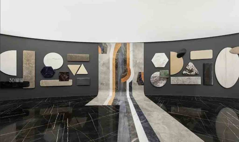
The first 5 metres decide whether visitors walk in or walk past. Put one hero statement here: a book-matched stone pair, a large-format porcelain scene, or your strongest new collection mounted on a tilted board with grazing light. Keep it to one message — the entry is for impact, not inventory.
Zone 2 — Bestseller Wall at Eye Level
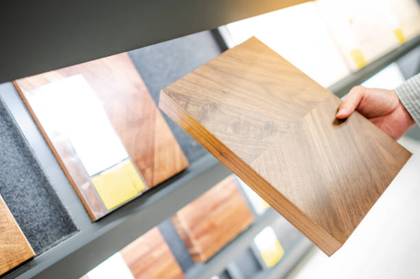
Mount your top 20 SKUs on wall panels where they are easiest to see and reach: the 90–160 cm eye-level band. Leave 8–12 mm gaps between samples so grout lines and surface texture stay visible from three metres away. Pair the wall with a low pull-out rack beneath so customers can lift a sample without losing the overview.
Zone 3 — Material Category Zones
Dedicate one clearly signed zone per material: ceramic, porcelain, natural stone, mosaic. Weight and size differ, so the fixture should differ too — supported stands for heavy stone, light hanging racks for thin ceramic. This is the single zoning move that most reduces staff interruptions, because buyers can find “the grey one” themselves.
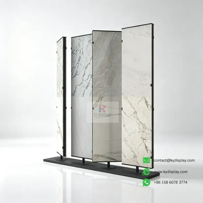
Zone 4 — Sliding Panel Premium Zone
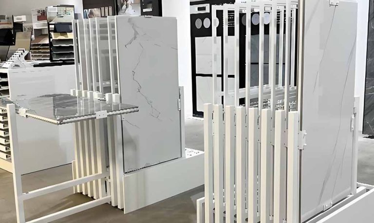
Premium large-format lines earn their own run of sliding panels. Set the track so the panel centre sits at 120–150 cm, matching the average buyer’s eye line, and add soft-close dampers so the motion feels deliberate. A single 4-metre run reveals 8–12 premium designs in seconds while keeping floor space free.
Zone 5 — Touch-and-Feel Counter
Lay loose samples of matte, glossy, structured, and anti-slip finishes side by side on a counter around 90 cm high with strong task lighting from above. Label each finish with its use case — wall, floor, wet area. Position this counter right after the premium zone so the natural sequence becomes: see the slab, touch the finish, ask for a quote.
Zone 6 — Compact Mockup Scenes
One tiled niche with lighting outperforms a full catalogue. Build 1 m² bathroom corners, kitchen splashback vignettes, or fireplace surrounds from your actual samples — as movable cubes on castors, so the same scenes can double as trade-show exhibits.
Zone 7 — Pairing Wall
Fix a modular grid of wall tiles on one side and floor or countertop samples on the other, with a few proven “recipe” combinations pinned in the middle. This turns browsing into designing, shows how a 60×60 floor reads against a 30×60 wall, and — in practice — generates the most social-media photos of any zone.
Zone 8 — Consultation and Quote Desk
End the journey at a desk with seating, a sample-return tray, and space for drawings or a tablet. Placing it deep in the floor plan — past the premium zone — gently pulls visitors through the whole showroom before they sit down.
From Zones to a Flooring Showroom Floor Plan
Turning the 8 zones into a working flooring showroom floor plan takes four passes:
- Draw the spine. Plan a main circulation aisle 1.8–2.5 m wide — wide enough for two people to walk and compare samples together — running from the entry to the consultation desk at the far end.
- Fill the perimeter. Wall-hung panels and tall towers belong on the walls, where they hold the most samples per square metre without stealing floor space.
- Float the islands. Put freestanding towers and the touch counter in the middle, keeping at least one clear sightline from the door to the hero wall.
- Stage the heights. Check every fixture against the planning table below.
| Element | Planning Height / Width |
|---|---|
| Bestseller band (eye level) | 90–160 cm |
| Sliding panel centre | 120–150 cm |
| Touch-and-feel counter | ≈ 90 cm |
| Feature board tilt | Forward tilt under grazing light |
| Main circulation aisle | 1.8–2.5 m |
Sketch it before you buy a single rack. A free floor-plan sketch — even on graph paper — exposes dead corners and aisle pinch points while they are still free to fix. Then treat the tile showroom layout as a living plan: place fixtures, watch the first month of foot traffic, and refine.
Fixture Picks for Each Zone
The fixture is what turns a zone from a drawing into a selling tool. Three workhorses cover most of the plan:
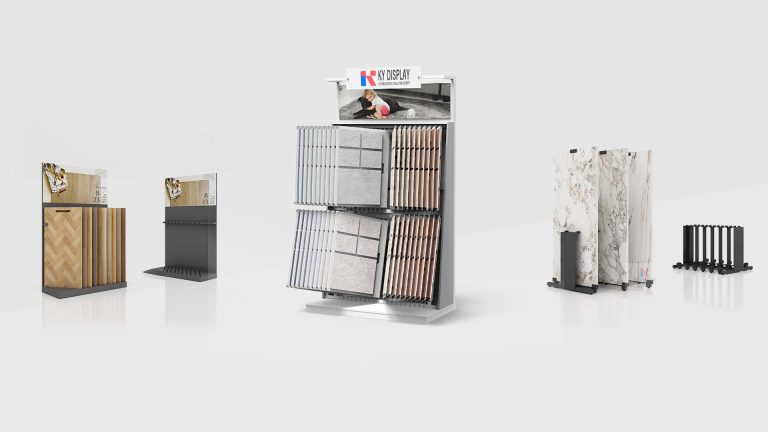
- Perimeter walls: a modular wall tile display carries the bestseller band and swaps collections in minutes.
- Category zones: a ceramic tile display stand holds high sample counts in a small footprint for the thin, light categories.
- Centre islands: a tile and stone showroom display anchors the middle of the plan with mixed-material capacity.
Choosing between freestanding towers and wall runs is its own decision — we break down the trade-offs in freestanding display towers vs tile display walls. For a deeper fixture-selection framework, see our guide to choosing the right commercial tile display rack, and pair the plan with the tactics in 10 proven tile showroom display ideas.
Tile Showroom Layout Mistakes That Cost Sales
- Stacking the perimeter and calling it a plan. Racks without zones force staff to guide every visit — the opposite of self-navigation.
- Burying bestsellers above or below the eye-level band. Anything outside 90–160 cm must be stocked there for a reason, not by accident.
- Blocking the spine. Aisle ends filled with promotions create pinch points; keep the 1.8–2.5 m main path sacred.
- No touch surfaces. An all-visual showroom skips the step where tile buyers actually commit.
- Set-and-forget. A tile showroom layout that never rotates looks stale within a season — schedule refreshes the way you schedule orders.
Get a Free Quote
Want a tile showroom layout drawn to your exact floor dimensions? KY Display has spent 16 years building custom tile, stone, and flooring display systems for distributors and retail chains worldwide — our design team turns your measurements into a free showroom plan with fixture placement. Send us your showroom size and we will reply within 24 hours.
Frequently Asked Questions
1. What is the best tile showroom layout for a small space?
Use the perimeter for wall-hung panels, run one 1.8–2.5 m spine down the middle, and place the hero wall at the far end so visitors cross the whole store. A 100 m² showroom comfortably fits five of the eight zones: entry, bestseller wall, two material zones, and the touch counter.
2. How wide should showroom aisles be?
Plan the main circulation path at 1.8–2.5 m — the range used in premium showroom builds — so two people can walk and compare samples together. Secondary paths between islands need less width, but should never force single-file browsing.
3. What height should tile displays be mounted at?
Keep bestsellers in the 90–160 cm eye-level band, set sliding panel centres at 120–150 cm, and keep touch counters around 90 cm high. Oversized feature boards can go higher when tilted forward under grazing light.
4. How many samples should a tile showroom display?
Map the floor plan to your top 20 SKUs first and fill the perimeter with long-tail items. As a benchmark, a standard display rack holds roughly 10–40 samples, while vertical towers and flip racks reach 30–60.
5. Should tiles be grouped by color or by material?
Group by material category first — ceramic, porcelain, natural stone — then arrange by tone within each zone. Material zoning removes comparison paralysis; tone ordering inside each zone is what makes the wall photograph well.
More Tile Showroom Guides
Planning the wider retail side? Start with tile display racks for retailers, then browse tile display ideas for retailers for fixture-level inspiration.